Search
Close this search box.

From Neon to Natural: 3 Easy Tricks for Perfect Leaf Green Buttercream

January 20, 2025
By Dara Waitkus, The Piped Peony

4-minute read

Let’s be honest—using leaf green gel color straight out of the bottle can leave your buttercream looking, well… unnatural. It’s that overly bright, almost neon green that screams “grocery store cake.” If you’re aiming for realistic, natural buttercream leafing, that artificial hue just doesn’t cut the mustard.

Straight out of the bottle, leaf green gel color—no matter the brand—gives you a harsh, neon green that’s anything but natural. If you’re going for realistic, lifelike buttercream leaves, read on….

I have good news! Three small inexpensive tricks can completely transform your neon leaf green buttercream into the natural shades of green you’ve been dreaming of. These 3 little tricks will have your buttercream flowers looking so real, you’ll have to resist the urge to water them!

So, without further ado, let’s jump right in and discover 3 super-simple ways to transform your neon green buttercream into a gorgeously natural shade of green. Don’t worry—each tip is so straightforward that absolutely anyone can do it, regardless of baking experience! 

1. Leaf Green + Black: Dramatic Depth

Add black gel coloring. Yep—that’s it! Here’s what makes adding black gel coloring to your green buttercream so magical: it doesn’t just darken the color—it cools it down, aka it mutes that ghoulish greenish glow. That slight shift takes the green from neon and unnatural to soft, natural, and sophisticated. The result? A cool muted shade that feels organic, grounded, and perfect for realistic leaves, vines, and greenery. The cooler tone adds a subtle elegance that blends beautifully into buttercream flower designs.

On the left is the before shot of a bowl of buttercream tinted with only Wilton’s Leaf Green gel coloring. On the right is the after shot of the same buttercream, now with a touch of Wilton’s Black gel coloring added.

What I love most about this trick is how it transforms the neon green into something versatile and elevated without overwhelming your palette. Need a suggestion for gel color brands? I swear by this one—it’s affordable, easy to find, and works like a charm every time. (No sponsorship here, just a personal fave!)

Pro Tip: Use a toothpick to add color. For black gel coloring, add the black slowly—a little toothpick dab at a time. Mix thoroughly, check the color, and only add more black if the green is still too neon. Adding color slowly is key because it’s much easier to add color than to take away color, and a little black gel coloring goes a very long way.

Simple Palette to Try: Shaded Green, Dusty Rose, and Gold

If you’re looking for a super simple color palette to pair with your cooled green, here’s a foolproof combo where our green takes the lead—perfect for a cake base color or cupcake swirl. The cool green contrasts beautifully with the dusty rose, while the gold adds just the right amount of brightness to tie it all together:

Pro-tip: When deciding on colors for your buttercream design, use color ratios to balance the colors—each color should not be used equally in the design.

In this palette. the main color, shaded green, should dominate and be the most visible, ideal for the base cake or main floral element. The minor color, dusty rose, adds contrast and softness but should appear less frequently. Finally, the accent color, warm gold, is just a subtle pop of color, or bling in this case. Balancing colors this way (having dominant, minor and accent colors) creates a cohesive, polished look. Using the same amount of color throughout your design can be problematic because no single color stands out, leaving the eye overwhelmed with too much competing visual information. You need one color to take the lead, while the others support it, ensuring the design feels harmonious rather than chaotic.

2. Leaf Green + Brown: The Earthy Touch

Adding brown gel coloring to your leaf green buttercream doesn’t just tone it down—it completely transforms it. The warmth from the brown creates a rich, earthy green that feels organic and grounded, moving far away from that overly bright, artificial green glow. This warm shift in color adds depth, making it perfect for realistic leaves, stems, vines, or succulents that actually look like they belong in nature.

Here’s the before shot of buttercream with a heavy amount of only Wilton’s Leaf Green gel coloring added. I intentionally colored it dark to show just how harsh and overwhelming plain Leaf Green can look when a lot of leaf green gel coloring is used—the color is reminiscent of Teenage Mutant Ninja Turtles. In the after shot, I toned it down by adding a hefty amount of Wilton’s Brown gel coloring, transforming it into a much more natural green. 
Here is our earthy green in action! The buttercream eucalyptus sprigs are made with our leaf green + brown buttercream. This earthy green pairs beautifully with the orange buttercream marigolds. You can find this marigold piping technique right here in The Piped Peony Academy!

And the best part? This earthy green pairs effortlessly with so many stunning colors. Think soft, romantic tones like blush pink, dusty rose, and peach. Or, for a bolder look, go for jewel tones like deep magenta, burnt orange or sapphire blue. It also looks beautiful with warm neutrals like terracotta, caramel, or ivory. Together, these combinations create palettes that are timeless, balanced, and totally Pinterest-worthy.

Where to buy: Wilton’s Brown gel coloring is my go-to—it’s affordable and easy to find almost anywhere. You can find it cheap here.    AmeriColor also offers a fantastic brown (find it here Soft Gel Paste – AmeriColor Corp.) that’s worth trying!

Simple Palette Anyone Can Try

Want an easy color combo with this earthy green that works every time? This palette is perfect for earthy, simple designs, wedding cakes, or any look that needs a touch of warmth without feeling overly rustic. It’s simple, cohesive, and stunning—no color theory degree required:

  • Main color: A warm peachy blush pink for softness and romance.
  • Neutral color: Creamy ivory to keep things light and balanced.
  • Minor color: Earthy brownish-green for a grounded, natural vibe.
  • Accent color: A hint of terracotta for that cozy, earthy feel.

3. Leaf Green + Red: A Natural Contrast

Okay, hear me out—adding a touch of red gel coloring to your green buttercream is magic. It neutralizes that in-your-face brightness and turns it into this soft, muted, olive-y color that feels very natural and grounded. it’s perfect for vintage-inspired designs, autumnal vibes, or anytime you want your green to play nice with other colors instead of stealing the show.

Simple Vintage Palette to Try:

If you’re working with a neutralized green and need a vintage palette to go with it, try this vintage combo. This palette feels like a vintage wildflower field, perfect for adding some realistic daisies to your design! Need a great daisy tutorial? Check out The Shasta Daisy class at The Piped Peony Academy for all the tips you’ll need to bring those blooms to life:

  • Main: Neutralized green (your softened, red-toned leaf green).
  • Accent: A warm golden mustard for a pop of richness.
  • Minor: Rose pink for a soft, romantic touch.
  • Neutral: Lilac purple for a cool, muted balance.
  • Supporting: Earthy green to tie everything together with a natural vibe.


Struggling to match buttercream to a specific shade of green?

A snapshot of a few classes from The Coloring Series at The Piped Peony Academy. Other classes in the series cover topics like matching pinks, achieving deep reds, making a whiter buttercream, and even in-depth color theory classes for those ready to dive deeper into mastering color.

The Matching to Greens class in The Coloring Series is here to help! Whether you’re aiming for a subtle sage or a bold cypress, this lesson teaches you how to mix and adjust your colors to match any design perfectly. No more guessing—just beautifully coordinated greens every time!

Final Thoughts

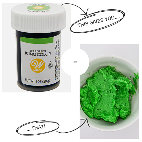
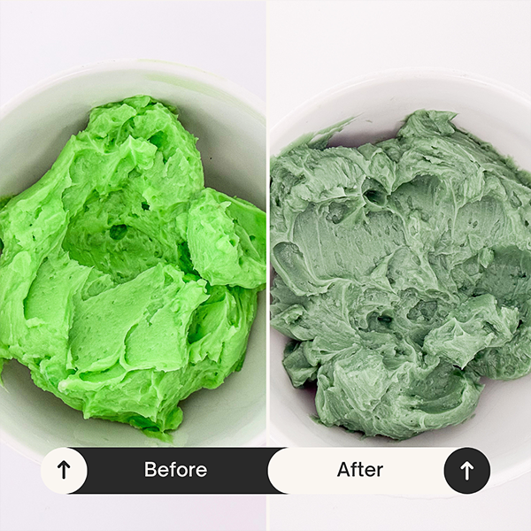
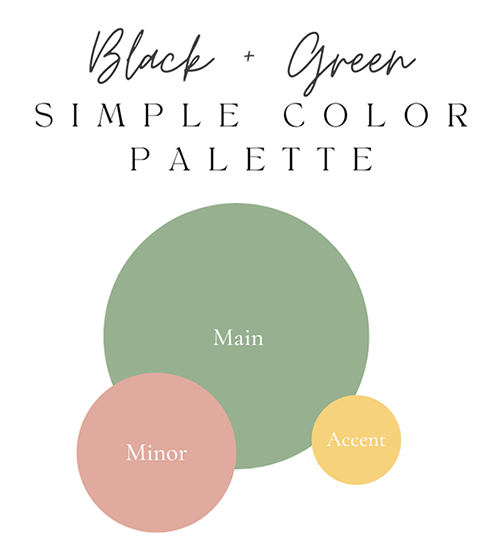
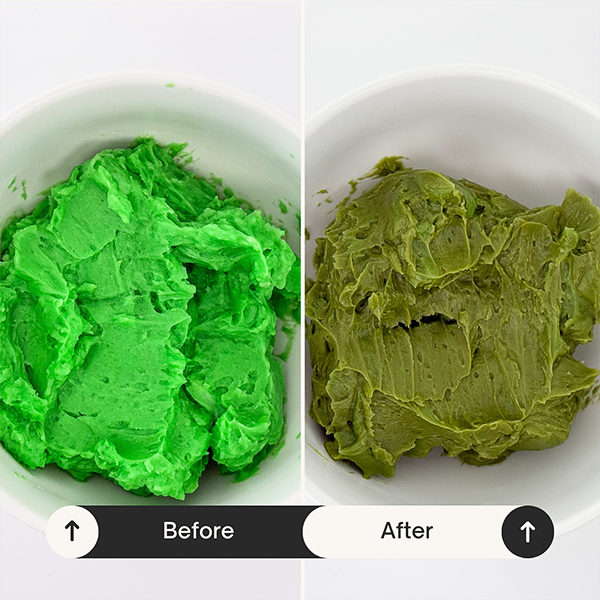
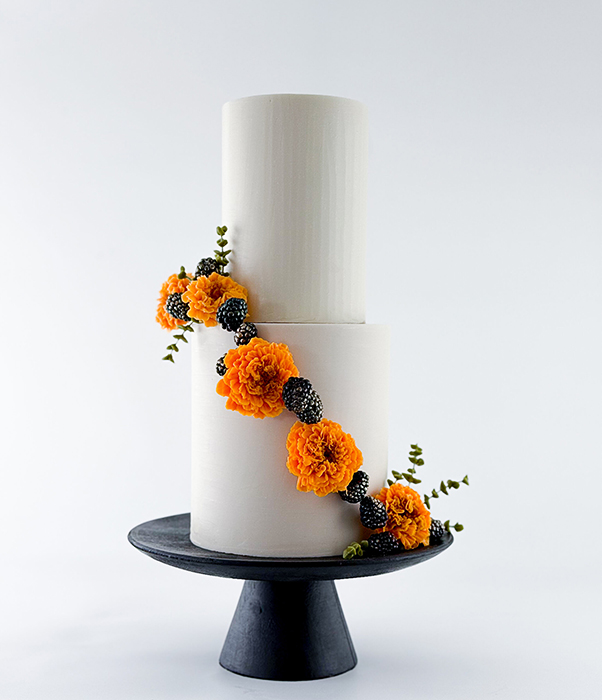
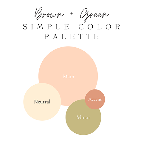
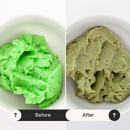
No one wants their buttercream leaves to look artificial or out of place, and luckily, they don’t have to. By tweaking your leaf green with brown, black, or red, you can achieve rich, realistic greens that elevate your entire buttercream flower design. Say goodbye to that grocery-store green, and hello to buttercream that looks as natural and beautiful as the flowers it’s paired with.

Happy coloring flower piping fam!


7 day free trial

[gravityform id="2" title="false" description="false" ajax="true" tabindex="49"]

Register

[gravityform id="2" title="false" description="false" ajax="true" tabindex="49"]

Already a member? Log in 

Log In