The Piped Peony Blog
Tips, tutorials, and inspiration for buttercream artists and bakers

5 min read
Mastering Tip Tuning: The Key to Realistic Buttercream Flowers
By The Piped Peony Team→

5 min read
6 Steps to Perfect Buttercream Daisies
By The Piped Peony Team→
5 min read
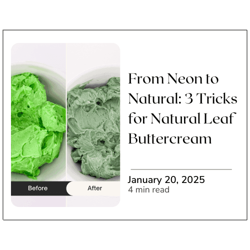
From Neon to Natural: 3 Easy Tricks for Perfect Leaf Green Buttercream
By The Piped Peony Team→

5 min read
4 Tips for Better Buttercream Flower Photos
By The Piped Peony Team→
3 min read
Top 10 Must-Haves
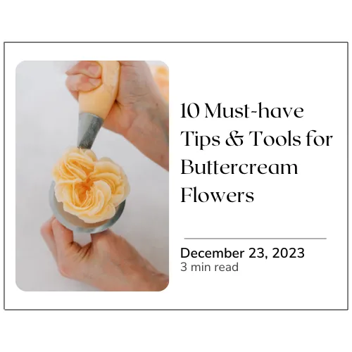
Top 10 Must-Have Tips and tools for Piping Realistic Buttercream Flowers
By The Piped Peony Team→